Rows and columns are most commonly used widgets and basic building block for any complex design.
Rows and columns in Flutter


Vaishnavi Ambidi


October 19, 2022
Flutter Row and Column Widgets
Column and Row widgets are the most commonly used widgets in Flutter and are used to make application layouts. It's hard to find any app that doesn't use these widgets. Almost every design can be broken down into rows and columns.
So learning these widgets thoroughly is quite essential, as it will make it easier for you to create simple or even complex layouts.
Let's get started
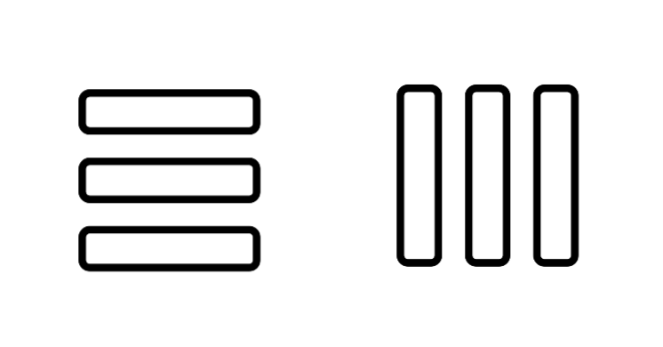
Overview of Row and Column widgets: These widgets are multi children widgets with similar behavior and properties. The major difference is a Row widget places its children horizontally, whereas a Column widget places its children vertically. As shown in the following images.


So the following snippet has a Row widget that has three containers in it. Similarly, we can define a Column widget too.
Row(
 children: <Widget>[
   Container(
     alignment: Alignment.bottomCenter,
     width: 100,
     height: 100,
     color: Colors.teal,
     child: Text(
       'Widget 1',
       style: TextStyle(fontSize: 18, color: Colors.white),
     ),
   ),
   Container(
     alignment: Alignment.center,
     width: 100,
     height: 100,
     color: Colors.indigo,
     child: Text(
       'Widget 2',
       style: TextStyle(fontSize: 18, color: Colors.white),
     ),
   ),
   Container(
     alignment: Alignment.center,
     width: 100,
     height: 100,
     color: Colors.deepOrange,
     child: Text(
       'Widget 3',
       style: TextStyle(fontSize: 18, color: Colors.white),
     ),
   ),
Properties:
Let’s see how all the properties work for rows and columns.
1) MainAxisAlignment and CrossAxisAlignment:
Row and Column widgets have MainAxisAlignment and CrossAxisAlignment properties which decide the position of the children widgets. But before that, let us understand the difference between MainAxis and CrossAxis in all two widgets. The row’s mainAxis is horizontal and the crossAxis is vertical, whereas the column’s mainAxis is vertical and the crossAxis is horizontal.
See the below Images to understand it more clearly.


MainAxisAlignment:
This property positions child widgets along the main axis of the layout.
There are 6 different options available in mainAxisAlignment.
-
mainAxisAlignment: MainAxisAlignment.start,
-
mainAxisAlignment: MainAxisAlignment.center,
-
mainAxisAlignment: MainAxisAlignment.end.
-
mainAxisAlignment: MainAxisAlignment.spaceEvenly,
-
mainAxisAlignment: MainAxisAlignment.spaceAround,
-
mainAxisAlignment: MainAxisAlignment.spaceBetween,
MainAxisAlignment.Start: Place the children from the start of the row or column.


MainAxisAlignment.end: Place the children at the end of the row or column.


MainAxisAlignment.center: Place the children at the center of the row or column.


MainAxisAlignment.spaceBetween: Place the space evenly between the children.


MainAxisAlignment.spaceAround: Place the space evenly between the children and also half of that space before and after the first and last child.


MainAxisAlignment.spaceEvenly: Place the space evenly between the children and also before and after the first and last child.


CrossAxisAlignment:
This property positions its child widgets along the crossaxis of the layout.
There are the following options in crossaxisAlignment.
- crossAxisAlignment: CrossAxisAlignment.start,
- crossAxisAlignment: CrossAxisAlignment.center,
- crossAxisAlignment: CrossAxisAlignment.end,
- crossAxisAlignment: CrossAxisAlignment.stretch,
- crossAxisAlignment: CrossAxisAlignment.baseline,
CrossAxisAlignment.start: This Places the children from the start of the row or column.

CrossAxisAlignment.end: This Places the children at the end of the row or column.


CrossAxisAlignment.center: This positions the children such that their centers align with the middle of the cross-axis. By default, the value of crossAxisAlignment is the center.
CrossAxisAlignment.stretch: This lets the children completely occupy the cross-axis.


CrossAxisAlignment.baseline: It places its children along the cross axis such that their baseline matches each other. If the main axis is vertical, then it will be treated as crossAxisAlignment.start, because baselines are always horizontal. It basically means that it will work with the Row widget with its direction as horizontal.
Row(
 crossAxisAlignment: CrossAxisAlignment.baseline,
  children: <Widget>[
   Container(
     alignment: Alignment.bottomCenter,
     width: 100,
     height: 100,
     color: Colors.teal,
     child: Text(
       'Widget 1',
       style: TextStyle(fontSize: 18, color: Colors.white),
     ),
   ),
   Container(
     alignment: Alignment.center,
     width: 100,
     height: 100,
     color: Colors.indigo,
     child: Text(
       'Widget 2',
       style: TextStyle(fontSize: 18, color: Colors.white),
     ),
   ),
   Container(
     alignment: Alignment.center,
     width: 100,
     height: 100,
     color: Colors.deepOrange,
     child: Text(
       'Widget 3',
       style: TextStyle(fontSize: 18, color: Colors.white),
     ),
   ),

You will notice in the above image, along with the above code (we have highlighted the code), that widget 1’s alignment is at the bottom center, and when you use crossAxisAlignment.baseline, other widgets align themselves with widget 1 at its baseline.
2)TextDirection:
This property determines the order in which to lay the children horizontally. The default is ltr, which means left to right. You can change to rtl if you are making an app that supports right to left (e.g., Arabic), and it will start placing widgets from the right-hand side. It is used to place widgets according to the right-hand and left-hand sides.


3)Vertical Direction:
This property determines the order in which to lay the children vertically. The default is down. It will place the widgets from top to bottom, and if you change its direction to up, then it will place the widgets from bottom to top. it is specially used to reverse the direction of the widgets. Now, this particular property will work with the column with its direction as vertical.


4)MainAxisSize:
It decides how much space should be occupied on its main axis. In any layout such as a row, column space is occupied by its children. After occupying the space, there might be some space remaining, so the mainAxisSize decides whether to utilize the maximum space available or the minimum. The default value is maximum.


We have wrapped the Row/Column widget with a container to check the behavior of the main axis size property. You will notice in the image above that when it is set to max, it takes up the whole width of the screen. You have to understand that it is not the container that is extending itself to the max-width of the screen but it is the row that is doing it. Though there isn’t any widget at the end, the row still takes up the whole space available to it. And when it is set to min, The Row only takes up the space that is needed for it to place the 3 widgets. If you add one more widget at the end of widget 3, the row will extend and fit the new widget inside it, taking up only the space needed for placing 4 widgets.
5)TextBaseline:
This property is responsible for the alignment of the text in the Row or Column widget to its baseline.There are two options available on this property that are.
Alphabetic: The horizontal line used to align the bottom of glyphs for alphabetic characters. Ideographic: The horizontal line used to align ideographic characters.
Bonus tips:
The row has no horizontal scrolling. So, when a large number of children are inserted into a single row that is not able to fit into the row, then it will give us an overflow message (for example, right overflowed by 560px ). And similarly, the column has no vertical scrolling. So, when a large number of children are inserted into a single column whose total children size is greater than the total height of the screen, then it will give us an overflow message (for example, bottom overflowed by 684px).
note: To fix this kind of error, we usually wrap the row or column widget with a SingleChildScrollView widget
So, these are the properties of the Row and Column widget, and the goal was to give you an overview of the Row and Column widget in a flutter. If you want to read more about row and column, head over to the flutter docs for row and column.